
Social Media Design
VIS 207 - Fall 2025


Reflection
Design strategy: My concept came to be because I learn a lot about the inequalities between men and women in International Relations and these observations of group behavior also occasionally apply to other fields. I also really enjoy history and so I wanted to explore the issues of misogyny through the lens of art, a field usually considered female dominated. However, in my research I found that in professional artistic settings diversity is incredibly low, with the majority being white and male. Since art is a visual form, I think this concept will be effective for those who are interested in visual media and creation.
Audience: My audience is individuals who are interested in art, inequality, or women. The tone I use in my writing is very simple because of some of the details I am discussing. I tried not to use too many filler words so that I could be clear and concise. I think this would appeal to many ‘artsy’ or creative type of person especially women. I wanted to keep the focus on art in general, so to keep the targeted audience at a broader scale.
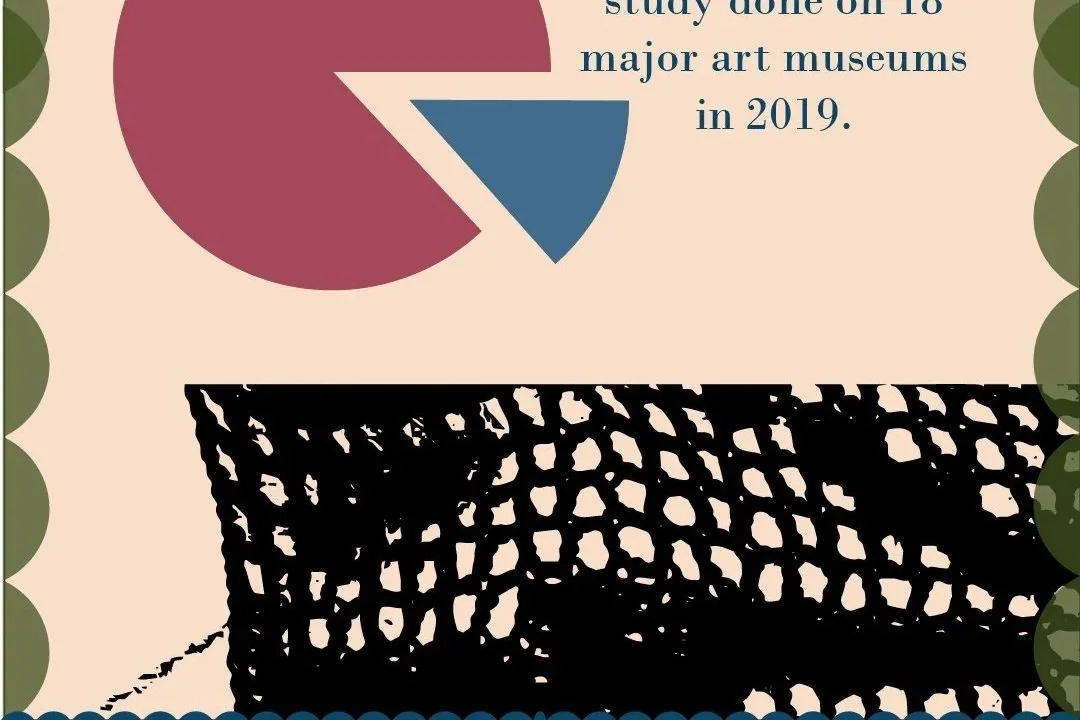
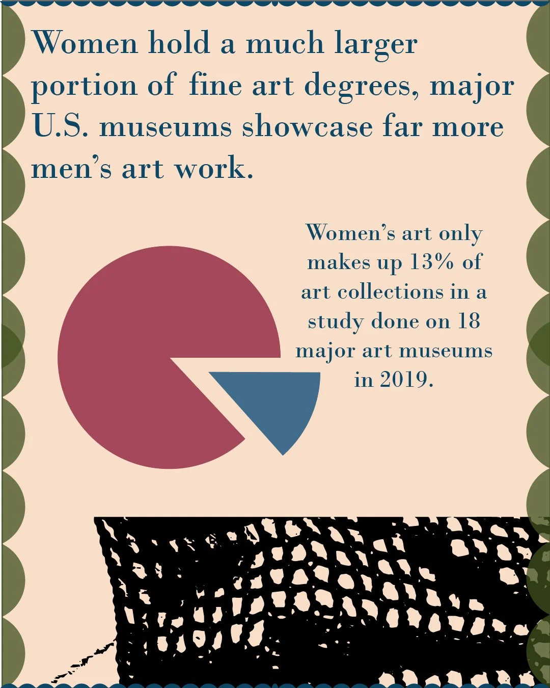
Visuals: I used a lot of art imagery to be incorporated into the details. I included little buttons and some string through icons. I also used a paint splash which was a really bold addition and I throught it drew the eye to the title for that page. I am really happy with the flow of my text. I feel like it is easy to go from page to page and when you look at it all together it is very continous across the entire project without being too uniform. I also tried to the figure and ground principle in my separation of the pie chart to really emphasize the proportion of comparison. The AI generation also gave me inspiration to develop a more f latlay aspect to my project with some icons. I think this helped minimize empty space while adding visual denotation to some of the concepts. For my graphic, I sourced my research from the National Museum of Women in the Arts which led me to a research paper published by the Public Library of Science in 2019.
Self Eval: I think I did well on this project, maybe around 90. I like the majority of this project and the visual aspects are fine in my opinion. I just had difficulty connecting my points in a social media post while prioritizing visuals, which is my fault because it is a lengthy topic. However, even though one of the pages feels slightly disjointed to me, they are all connected technically. I really like the image I used of the crochet work across two slides, it was very visually interesting and it draws the person the next page. The color theme I used was also very connected, I wanted to develop a medival color palette with the tan, navy, and burgandy. I also added a hint of more modern colors with the sheer olive/moss green, light pink, and faded red to highlight different aspects of the visuals in each slide.
Growth: I would say I learned many things from this project, but one of the more interesting aspects of this assignment was the transfer from one platform to another to animate/add more to the post. I really explored some of the export options for the assets and grouping which was interesting. The animations we explored within adobe express were fun to add. I also really enjoyed generating images using photoshop and illustrator. I found some techniques that I did not know before and were honestly much easier than some of the manual work, so I will definitely be using those skills in the near future.
Style Sheet
Title - Bodoni MT, 135 pt, #0c4767
Heading - Bodoni MT, 68 pt or 100 pt, #0c4767
Paragraph - Bodoni MT, 48 pt, #0c4767
Captions- Bodoni MT, 48 pt, #a4485b
Colors used:
Background - #f9dec9, tan
Strings, Large pie, and Paint splash - #a4485b, faded red
Little pie - #416c8c, dusky blue
Icons and Strings 2- #550c18, burgundy
Needle - #4d4d4d, grey
Drops - #f0d2d1, pink/lavender
Scallops - #41521f, olive/mossy green